


Renovera
An Ayurvedic Identity, Reimagined
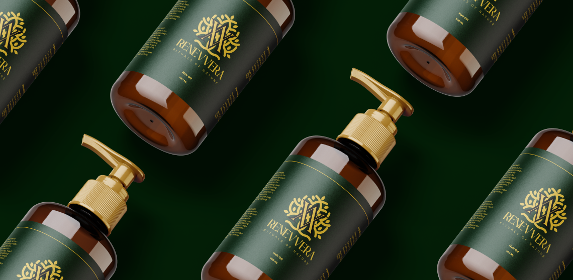
Renevvera
A modern identity rooted in Ayurveda.
A visual identity designed to bring together nature, wellness and premium contemporary aesthetics through a distinctive monogram-led logo system.
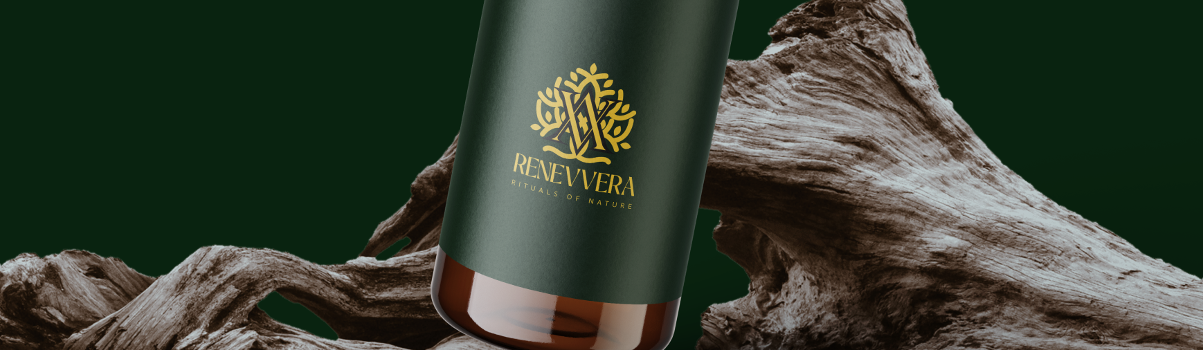
More than
a logo.
Renevvera is positioned around the relationship between natural ingredients, Ayurvedic wellness and a refined premium experience.
The identity needed to feel authentic to Ayurveda without becoming overly traditional or visually predictable. The goal was to create a system that could work equally well across packaging, digital interfaces, documents and future product extensions. Dubai is where ambition, culture and modern luxury come together. The brand was developed around this distinctive character, creating an identity that feels contemporary, premium and unmistakably connected to Dubai. The goal was to create a refined visual identity that reflects Dubai’s global outlook while maintaining a strong sense of authenticity. The branding system was designed to work seamlessly across digital platforms, physical touchpoints, marketing materials and future brand extensions.
Balancing
tradition &
modernity.
Avoid a generic Ayurvedic identity
Traditional Ayurvedic brands often rely heavily on obvious botanical illustrations and conventional visual language. The challenge was to create something recognisably natural without looking ordinary.
Make the identity feel premium
The visual language needed to communicate quality and sophistication while maintaining the warmth and authenticity associated with natural wellness.
Build an identity that scales
The logo had to remain recognisable across packaging, website usage, favicon, documents, small-size applications and different background colours.
Turning the
idea into a symbol.
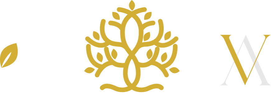
Instead of treating the tree, leaves and typography as separate elements, they were brought together into one cohesive visual language.

Tree
Represents growth, stability and the connection between nature and holistic wellness.

Leaf
Introduces a clear botanical reference while keeping the identity simple and contemporary.
VV Monogram
The “VV” becomes the distinctive core of the identity, integrated into the botanical structure to create a memorable brand mark.
One mark.
Multiple meanings.
The final symbol combines the VV monogram with botanical forms to create a visual connection between identity, nature and wellness.
Nature,
refined.
Deep greens,
warm golds.
The palette combines a deep natural green with a warm gold accent to create a balance between botanical authenticity and premium presentation.
Renevvera
An editorial-inspired typographic direction creates a premium and distinctive personality for the brand.
Designed to
adapt.
The identity was extended into different logo configurations to maintain recognition across digital and physical touchpoints.
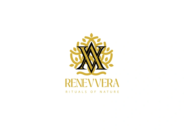
 FAVICON
 MONOGRAM
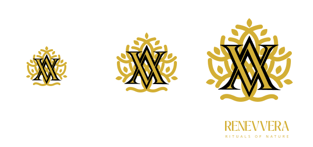 SMALL-SCALE MARK
From botanical
elements to
brand language.
The final identity transforms multiple visual references into one recognisable system.
The integrated VV monogram gives Renevvera its own visual signature, while the botanical framework communicates the natural foundation of the brand. The restrained palette adds a premium layer and allows the identity to work across multiple applications.
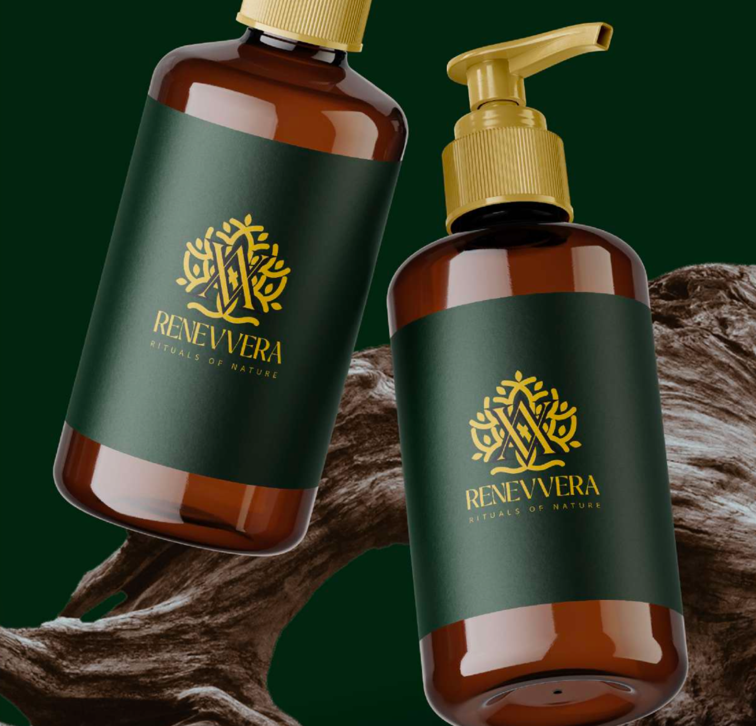
Taking the identity
into the real world.
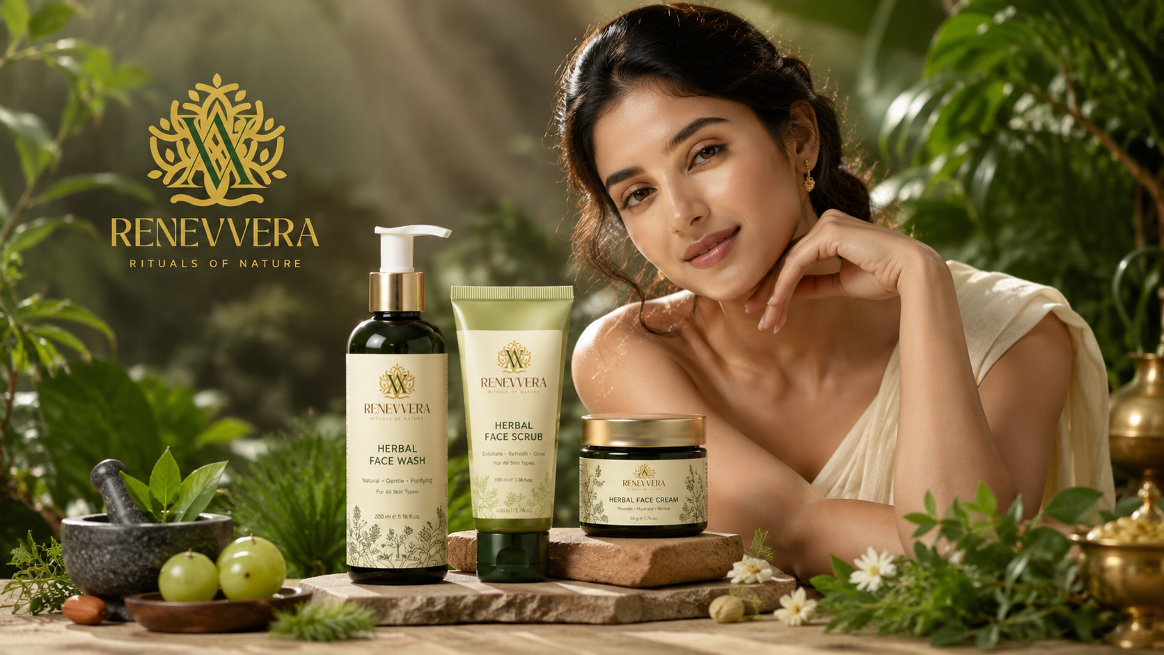
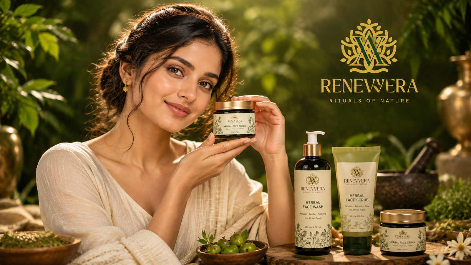
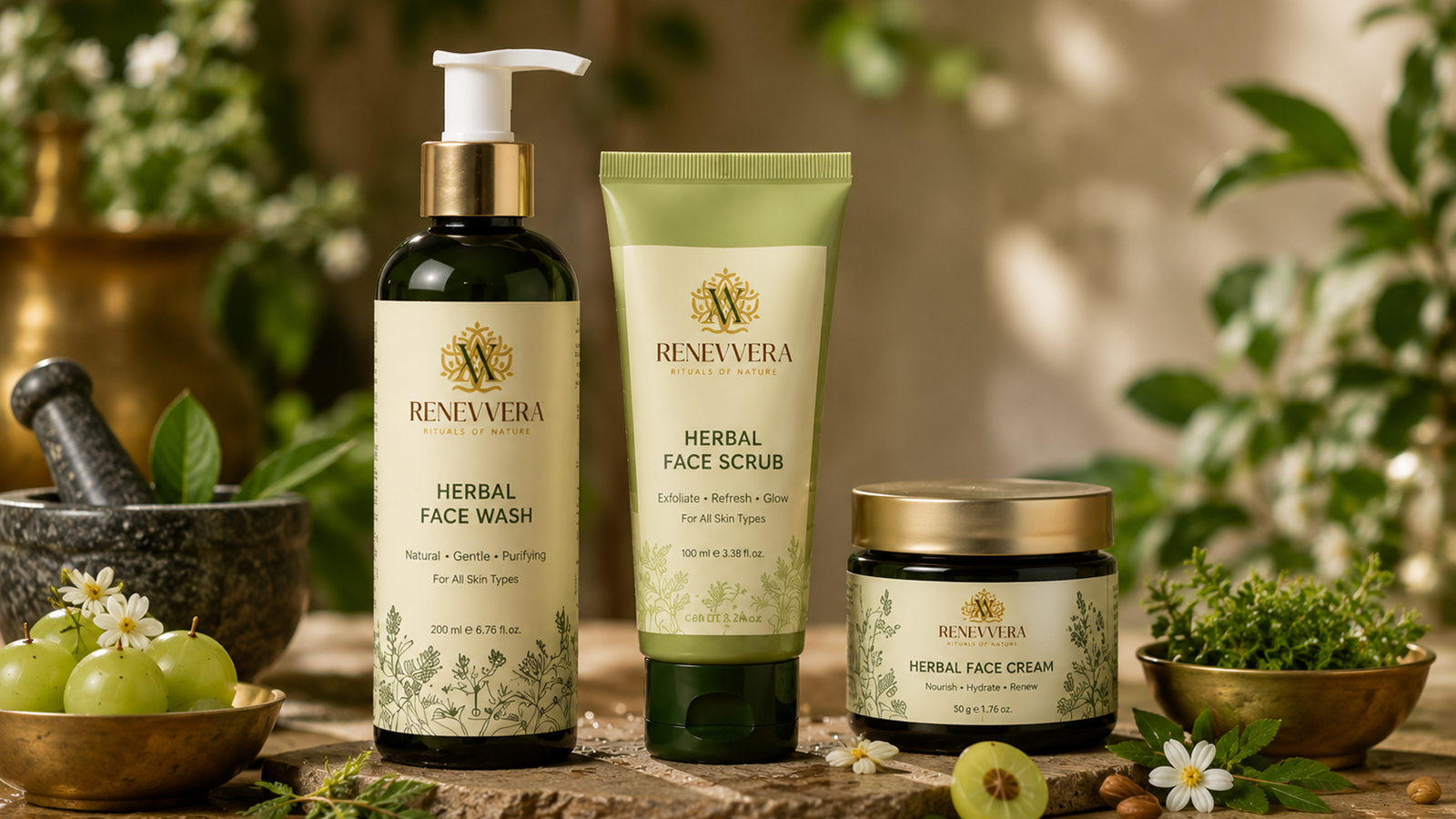
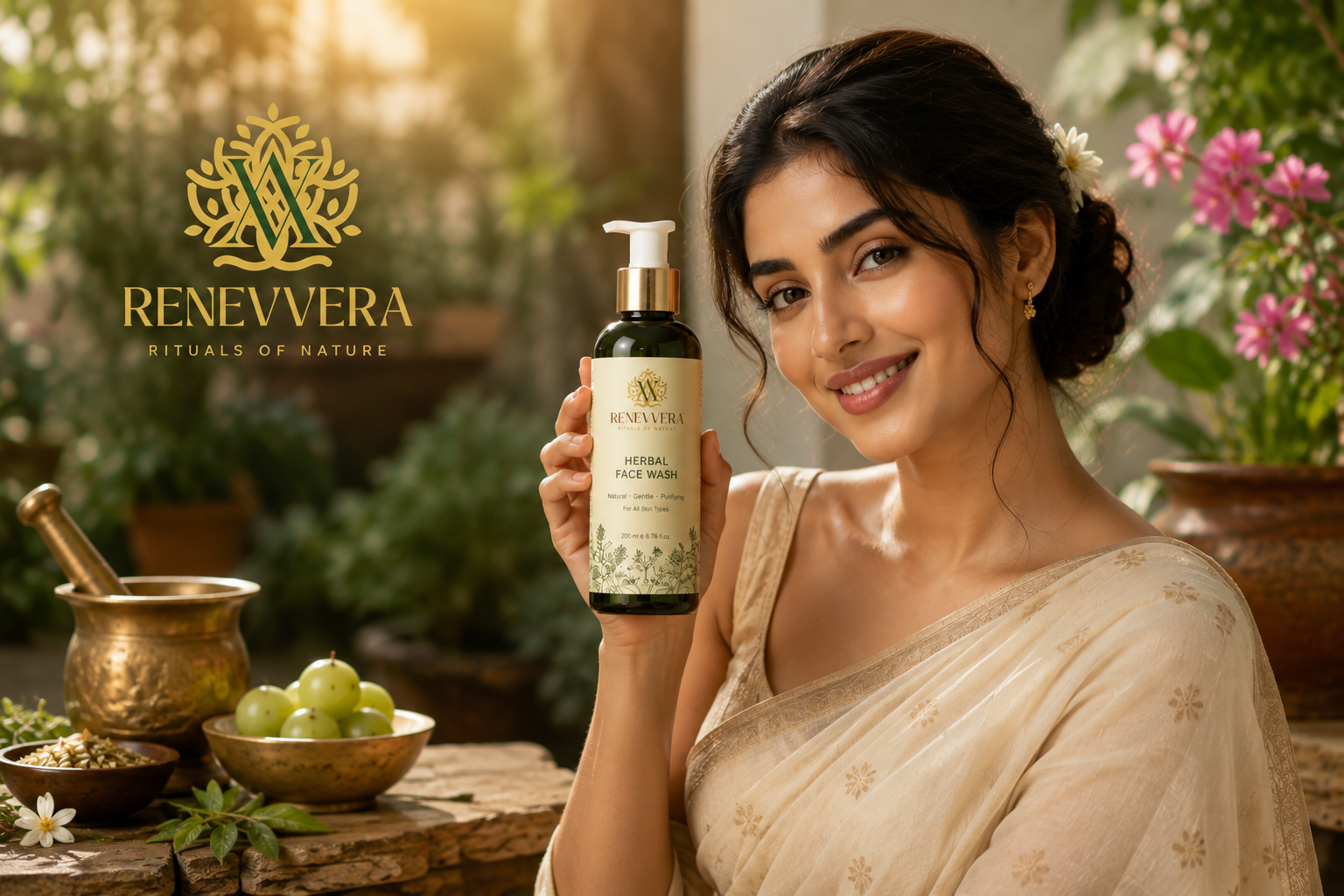
A distinctive Ayurvedic identity built around nature, balance and refinement.
Renevvera moves beyond a conventional Ayurvedic visual language by combining botanical symbolism, a memorable VV monogram and a premium visual system into one cohesive identity.